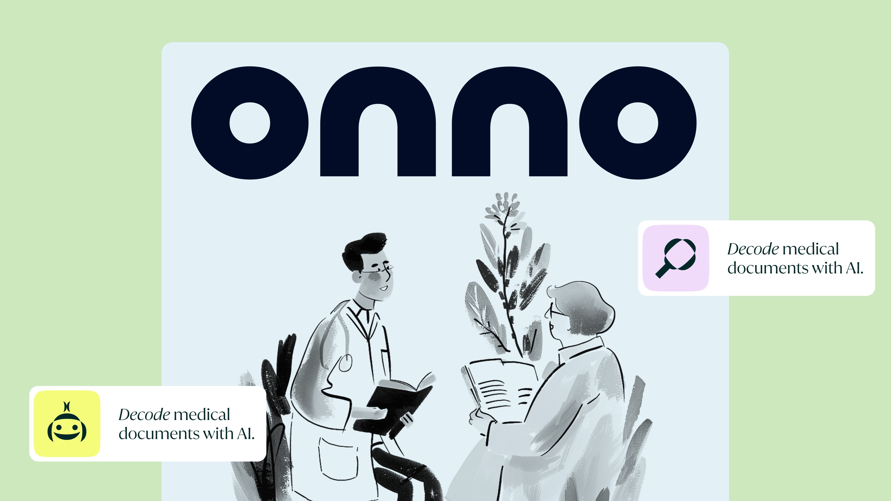
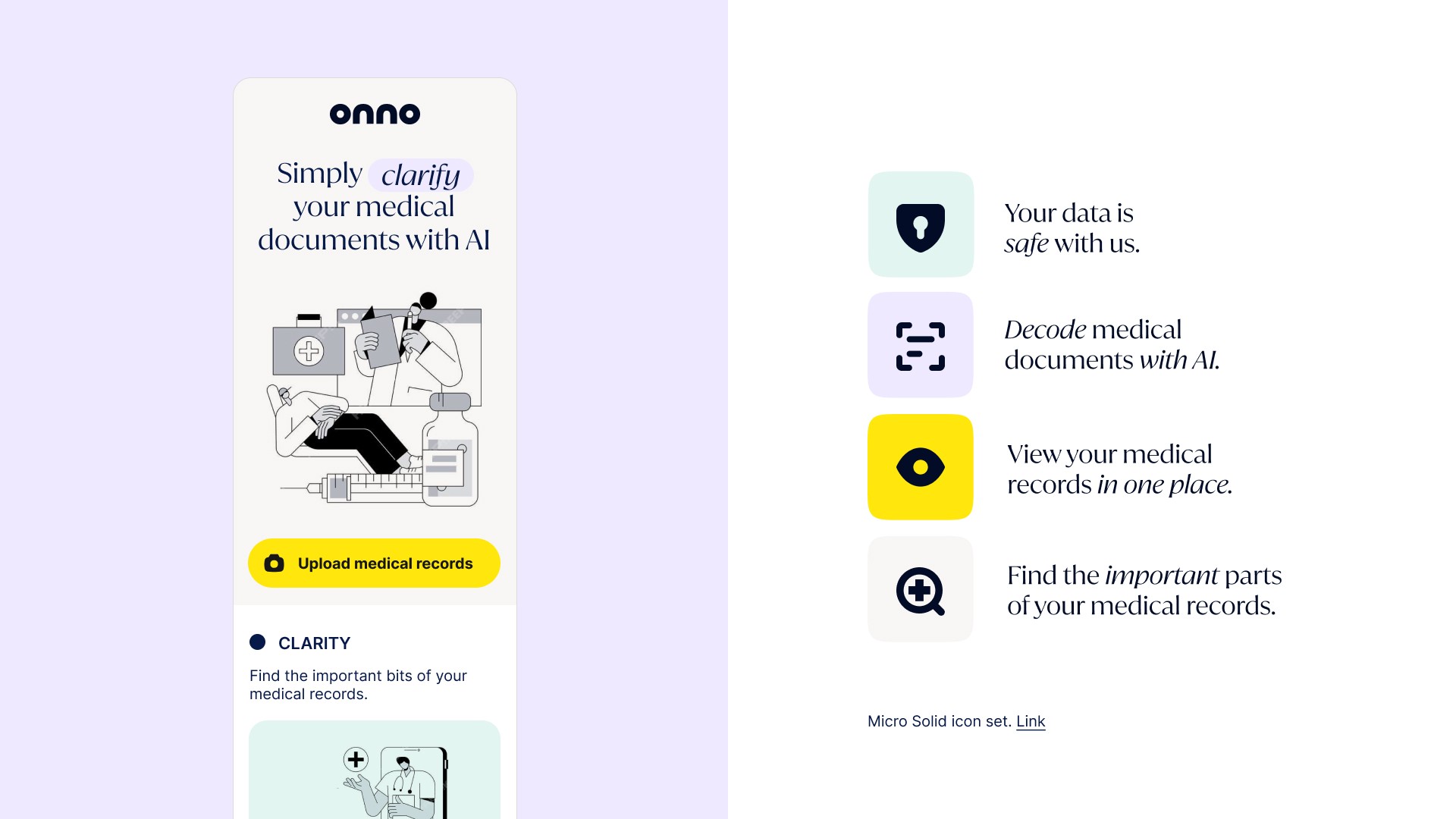
PROJECT
Simply Onno is a web app that translates medical documents into plain language and helps users understand their options and next steps.
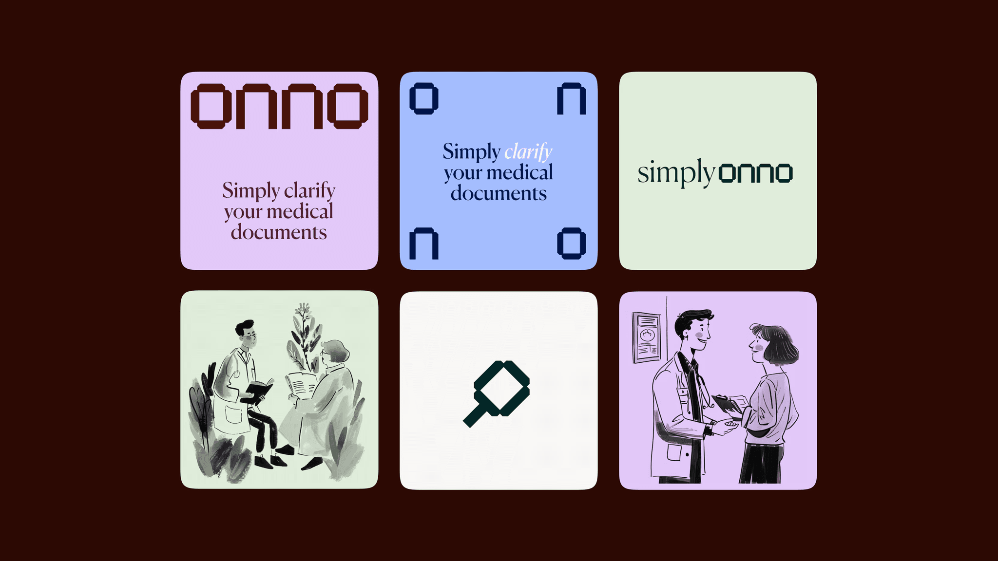
The founders—friends of mine and both designers—asked me to help define the brand’s visual identity in a one-day sprint. They came in with a tight, thoughtful brief and used the time intentionally: we focused on selecting colors, typography, and illustration style. It was one of those rare collaborations where everything just clicks; clear vision, mutual trust, fast decisions.
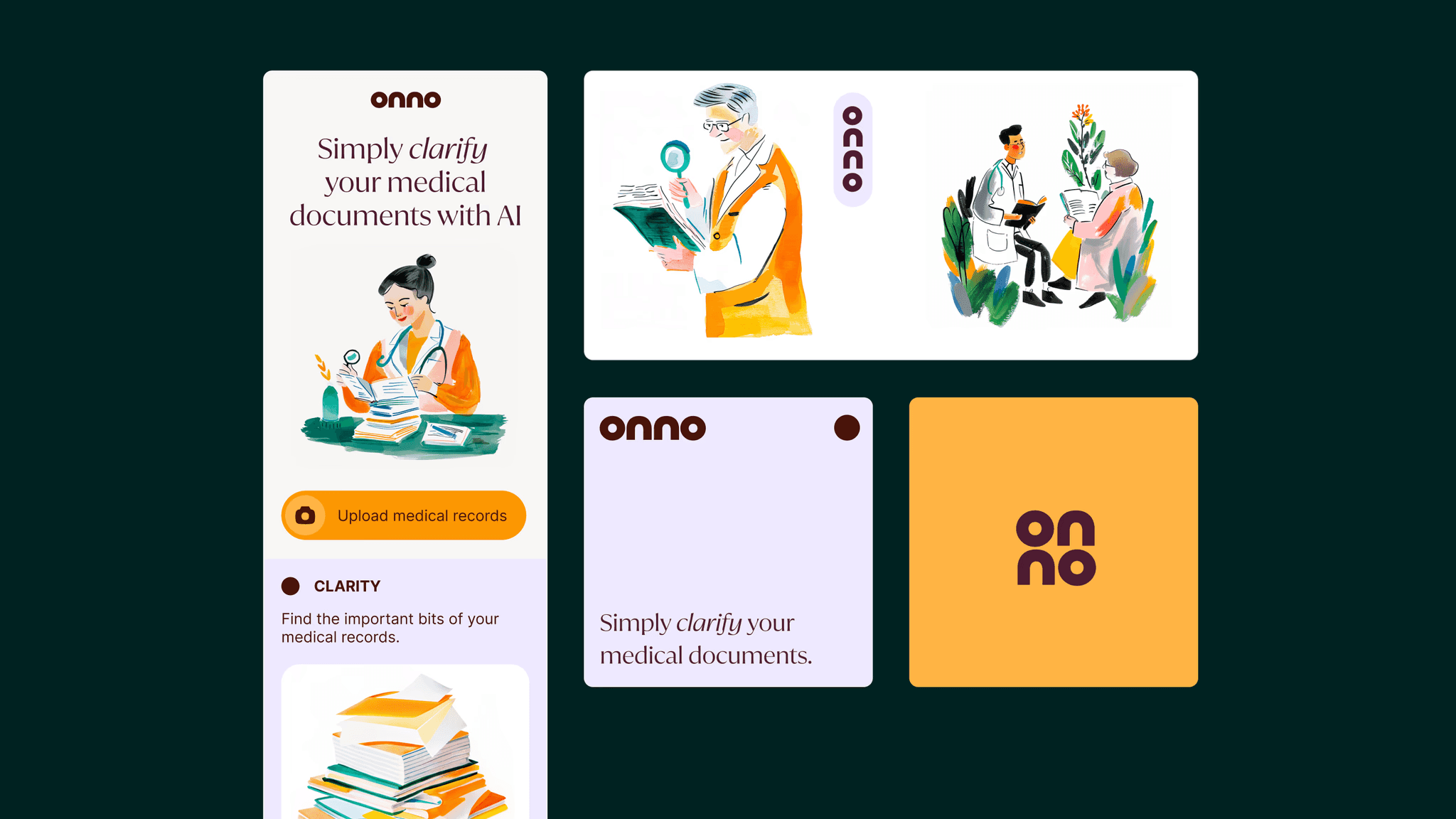
With only a day to work, I used AI tools to quickly prototype multiple illustration directions. This helped us skip the “imagine this style, but for a doctor” phase and jump straight to relevant, healthcare-specific visuals. It was a good reminder of how AI can support fast, collaborative creative work when used with care.
my role
Brand Identity, Logo Design, Illustration Art Direction
"Collaborating with Charlota to define our Simply Onno brand identity in just one day was incredible.
Her adeptness in translating our input into a wide range of tangible, well-executed brand directions, coupled with her flexibility in working modes, enabled us to create a distinct, differentiating, and reliable identity for Simply Onno that is loved by our users."
Karen Hentschel
Co-Founder at Onno, ex-IDEO