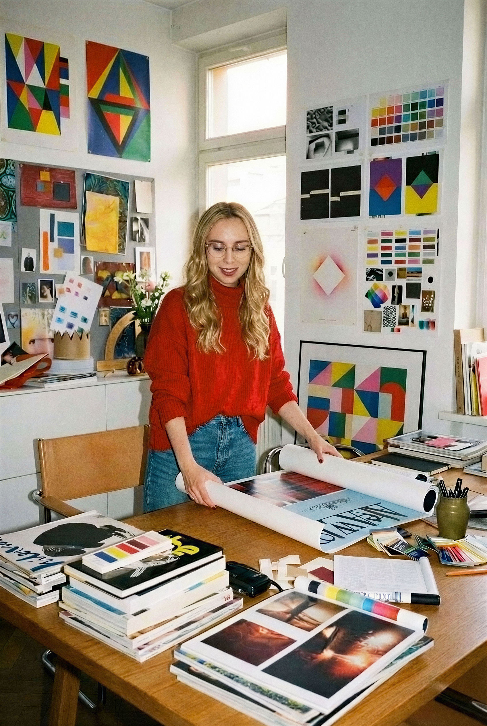


This year has been about finding a good rhythm. Balancing curiosity and experimentation with laser-focused productivity and shipping.
As a working mom with a toddler, I worried at first that limited hours would throttle my creativity, but in practice they just sharpened my focus. I went from feeling "I HAVE to say no projects" to "I GET to say no to projects". That's a nice, and definitely privileged, position to be in.
I worked with a small group of ambitious founders who see brand design as leverage; and lot of them trusted me enough to shape the briefs together. I had two long‑term retainers and balanced that with blazing fast brand design sprints. The routine of switching between deep, ongoing partnerships and fresh, exploratory projects has kept my energy up.
One of the biggest lessons for me this year was learning to write my own briefs. Instead of waiting for clients, I started pitching the ideas I actually wanted to work on. When a client says yes to that, the whole dynamic shifts — you’re no longer just executing, you’re building something together. It’s a small change, but it makes the work feel much more energising and meaningful.
Working with early-stage startups also reminded me that you often have to be the one who really cares. When you’re the only designer, there’s no one else to push for clarity or protect the quality of the work. You have to step up, define the problem, make it YOUR problem, suggest direction, and do the work. I enjoy that.
I also touched wildly broad types of deliverables this year: web design, brand identity, packaging, logos - but also colour palettes for hardware, art directing and planning photoshoot, conference booths, branded merch, AI‑generated brand image library; and even designing press‑on nails!
Some of the projects are live now and I can share them here, while others remain under wraps.
This was by all means a great year.
Grateful.
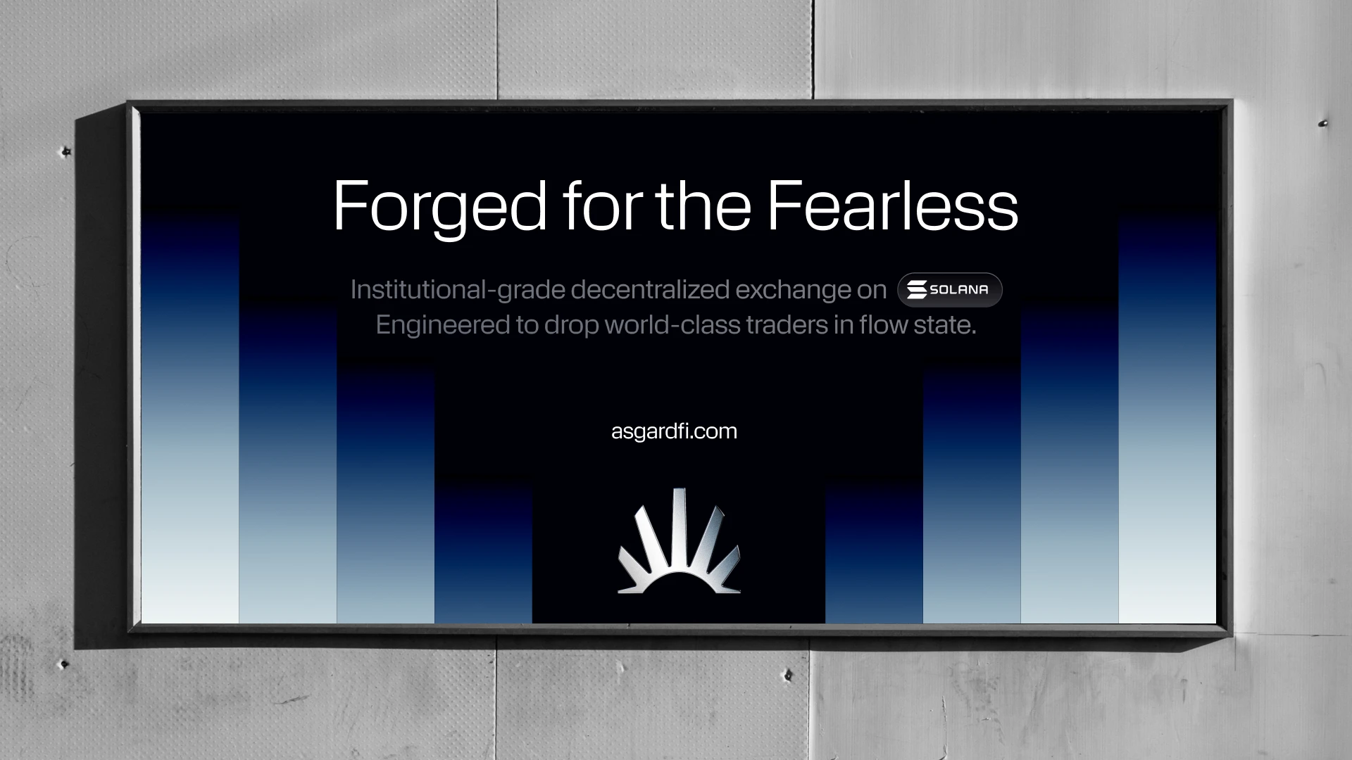
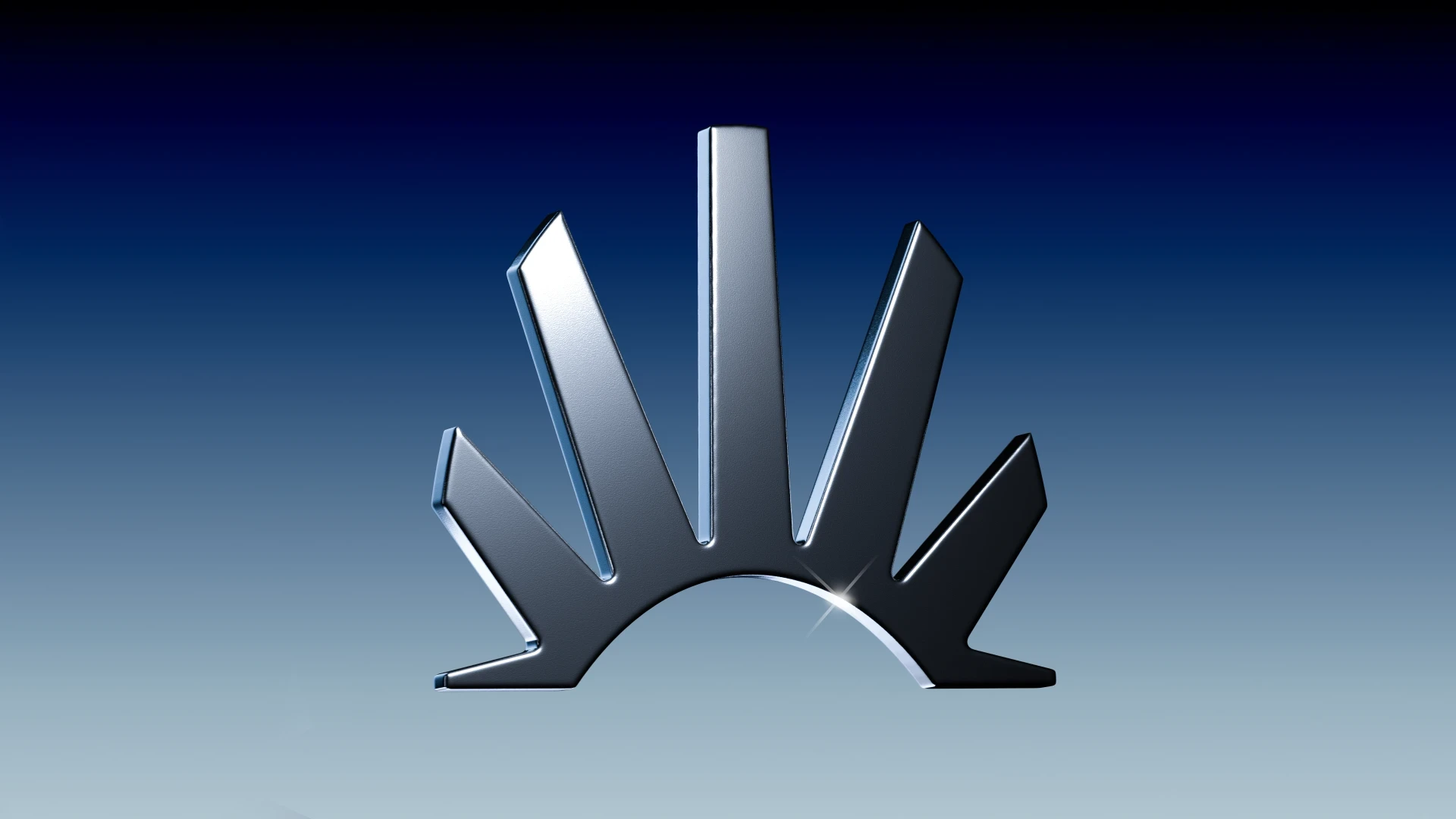
ASGARD
Brand Identity + Website Sprint
In a brand design sprint for Asgard, a DEX on Solana, I built a brand system built with a limited palette, cityscape/crown-like mark and rhythmic gradients. I love how they found its way into motion + interaction on Asgard's site, built by Jan!
"I am so so grateful to have worked with Charlota and Jan. I learnt so much about building a brand during the course of building Asgard's brand and till this date I learn something new from the brand kit."
Prastut Kumar
CEO, Asgard
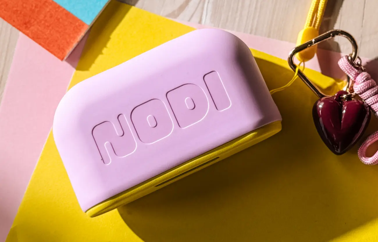
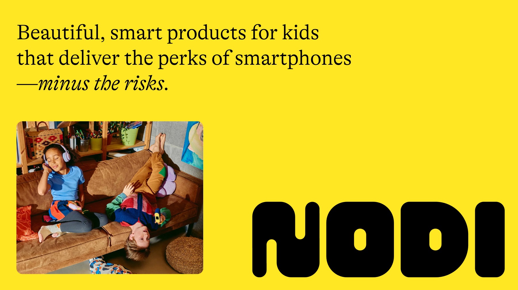
Brand Identity, Packaging, E-commece site, Advertising, Art Direction
A whole year of collaboration with a German startup building a new kids’‑tech brand and their first product: NODI Flip, a screen‑free audio device that lets children send voicemessgaes and listen without smartphone dangers. I developed the identity, logo, packaging, e‑commerce site and ad assets, art‑directed the photo/video shoot and guided CMF.
Personal Highlight:
Seeing the logo I designed on a real hardware!!
"Working with Charlota was one of the best early decisions we made at NODI. She do the kind of work that usually takes an entire agency team, but faster, better and more efficiently. I’d recommend her to any founder looking to build a standout brand with someone who really gets it. her talent is rare, even globally!"
Pascal Blum
Co-founder
Brand Identity
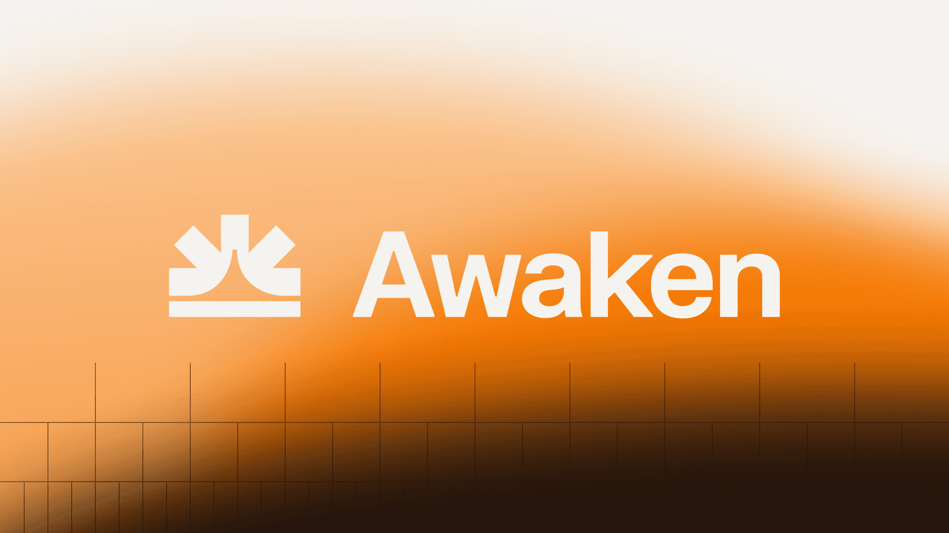
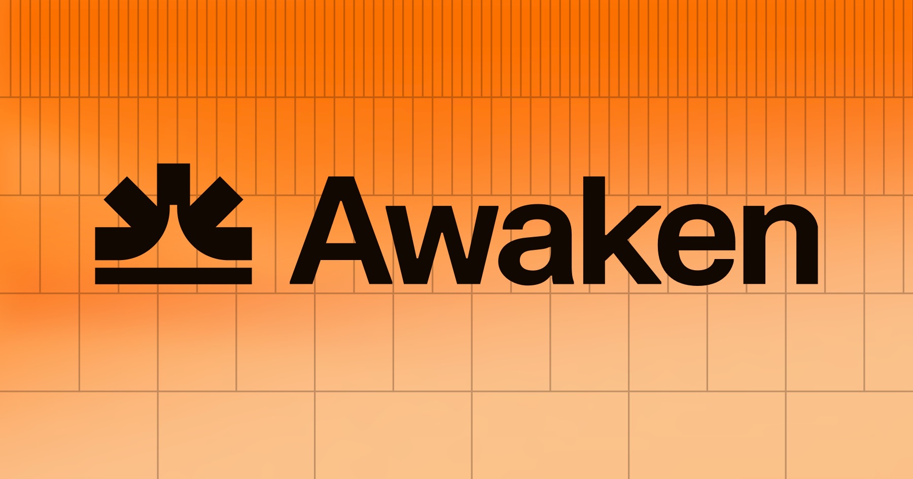
An automated crypto tax tool aiming to turn transaction chaos into calm clarity. In a lightning‑fast sprint I developed a radiant identity built from sunrise gradients and structured grids, with a logo that hints at letter A, sun and automation. The deliverables – identity, logo, illustration system and marketing templates collectively transform a dreaded chore into something more serene.
"Within days we had brand directions to choose from and each was different, so we got a good mix. And the iteration was super fast - that’s what I liked the most. People say they love our new brand. I already recommended Charlota to other founders and would 100% do it again!"
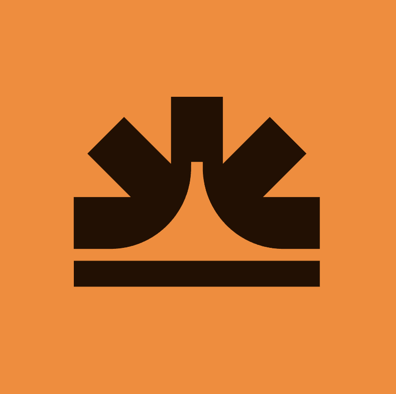
Andrew Duca
Founder, Awaken
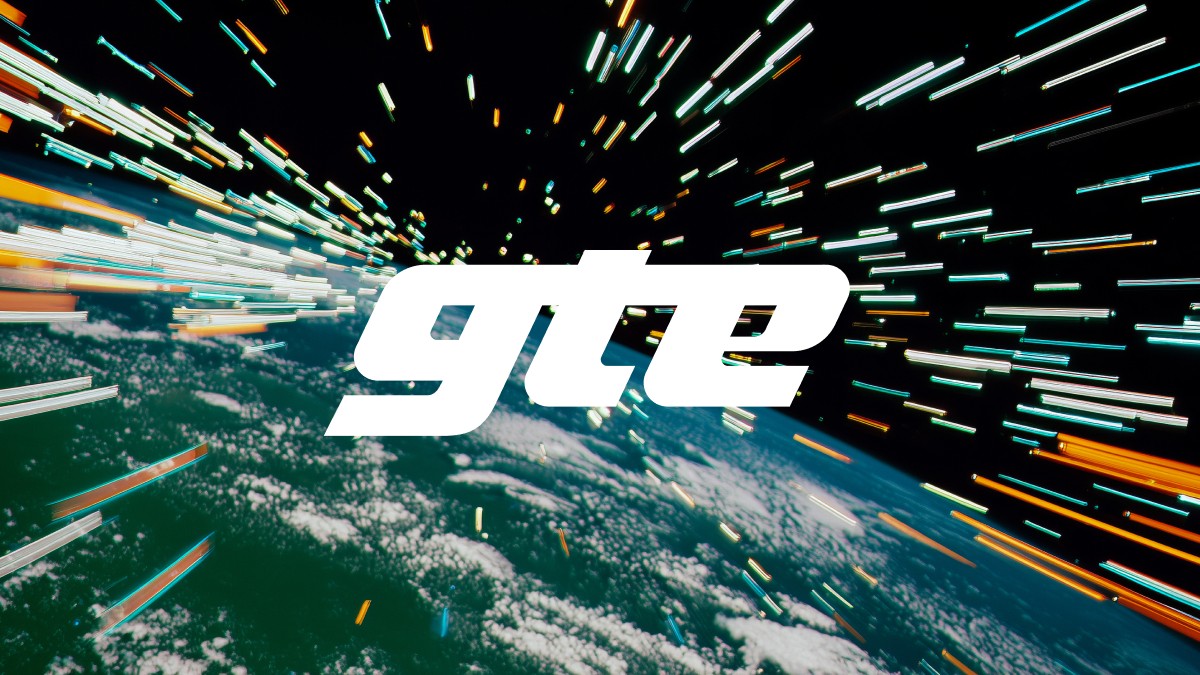
GTE
AI-generated brand image library
I previously designed the brand for GTE, and this year I worked on an AI-generated image library to support their ongoing brand communication. It was a great chance to properly dive into newer tools l(Reve, Flora and Nano Banana), alongside the "old" (lol) ones (Midjourney, Adobe CC). In the end, it took roughly 4,000 generated images to curate a final set of 50 that truly fit the brand.
"This is exactly what we wanted. Really satisfied with it and we're going to make you proud on how we integrate it back into the brand!"

Enzo C.
Founder, GTE

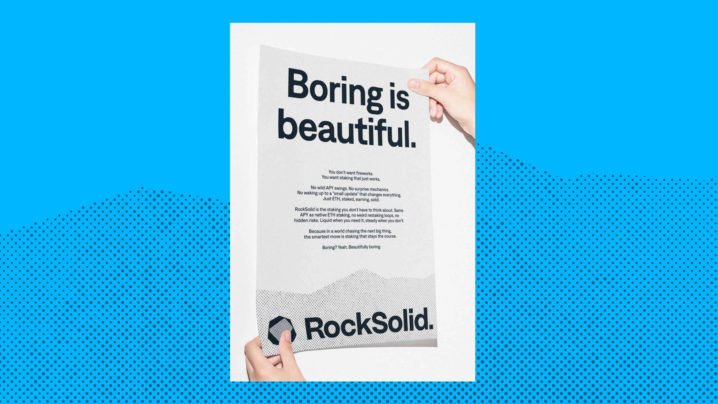
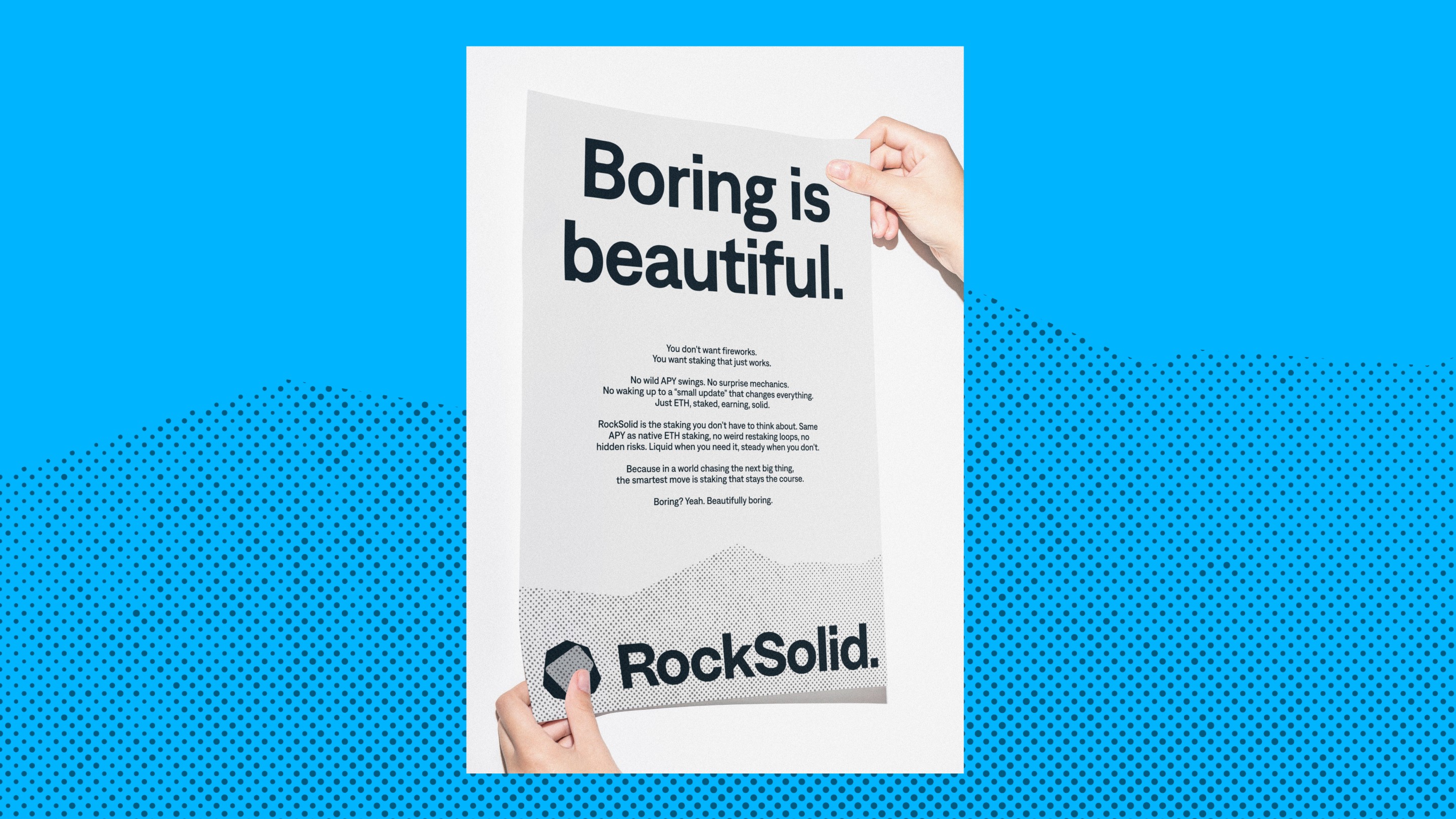
ROCKSOLID
Brand Identity
RockSolid is a liquid vaults platform built on a simple promise. I partnred with the founders partnered to create a clear, no-nonsense brand e that pushes back against over-engineered DeFi and creeping centralization. I led brand strategy and tone of voice—confident, direct, slightly rebellious—then created the identity and art-directed the website built by Jan.
"We love the brand, the assets, the website, the tone of voice. It's a really great job! We've also very much enjoyed the collaboration. We felt in very professional hands the whole way through and we had fun!"

Steve Pack
CEO, RockSolid
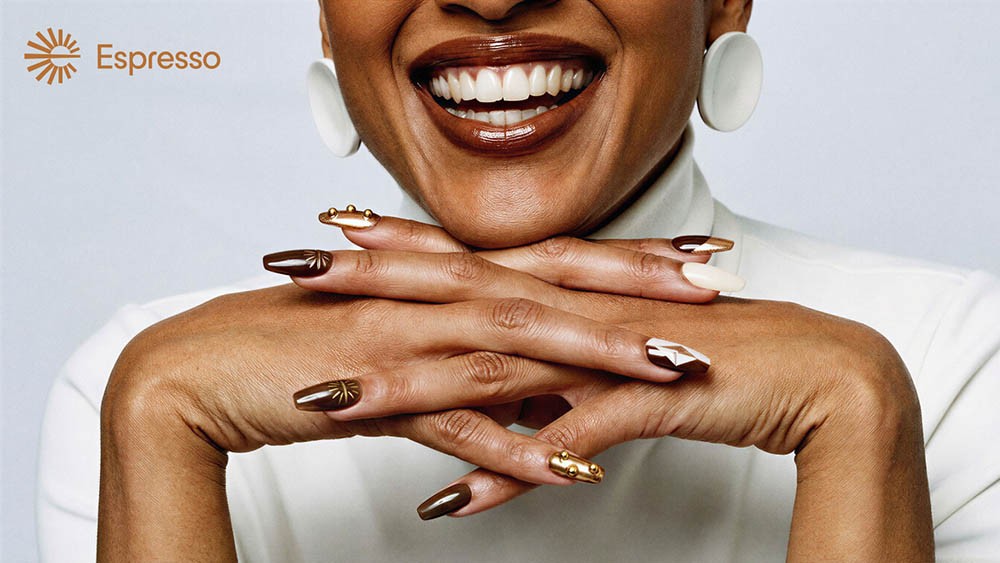
Espresso Systems
Design retainer
I developed Espresso’s brand identity a few years back, and this year Martin Egrt and I were on a nine‑month, wildly varied retainer with the team, producing everything from the website, video storytelling, a sell-out NFT Collection (!! yes, still in 2024), conference booths, T‑shirts, logos and packaging for plush toys for this crypto infra (a base layer for rollups), making Ethereum ecosystem more united. I enjoy coming back to the brand work I've done in the past and stress-test it by designing within the visual system, and this was the case. I'm so grateful for the team's trust and possibility to shape our own briefs.
Personal Highlight:
Designing a set of NFC-enabled press-on nails in the Espresso design. Classy!
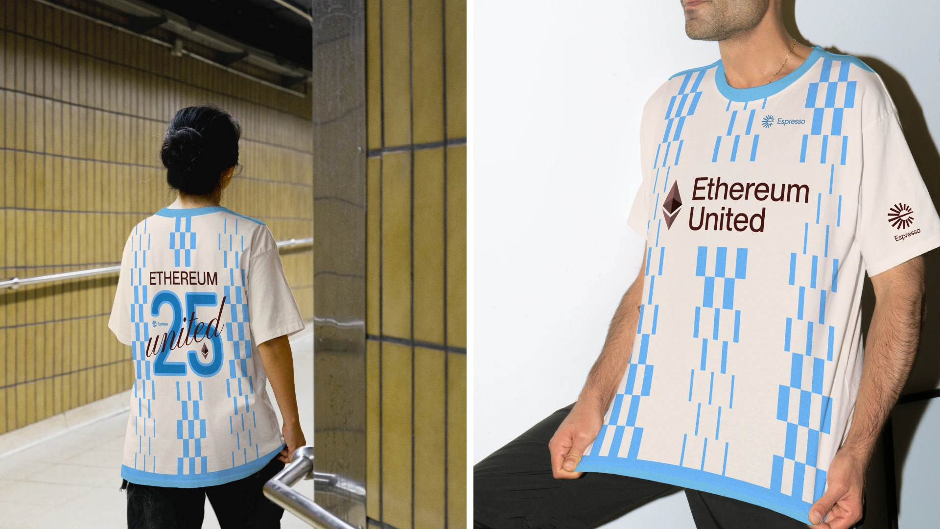
"Martin and you and the whole We3 fam are truly CORE CONTRIBUTORS to the Espresso project. You have helped to build the brand and community in so many unexpected ways over the years and it's been incredible to see. We have been so grateful for your partnership these past 9 months and you can bet that we will be staying in close touch!!!"
Jill GUNTER
Co-founder, Espresso Systems
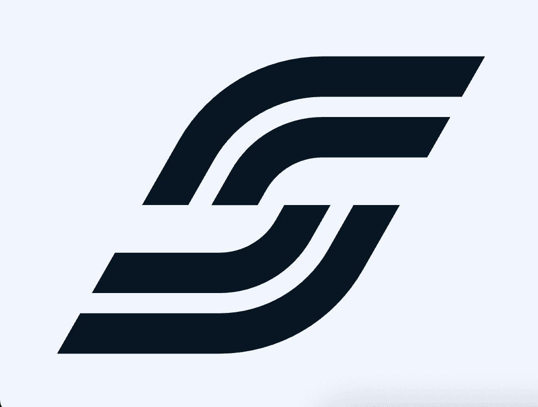
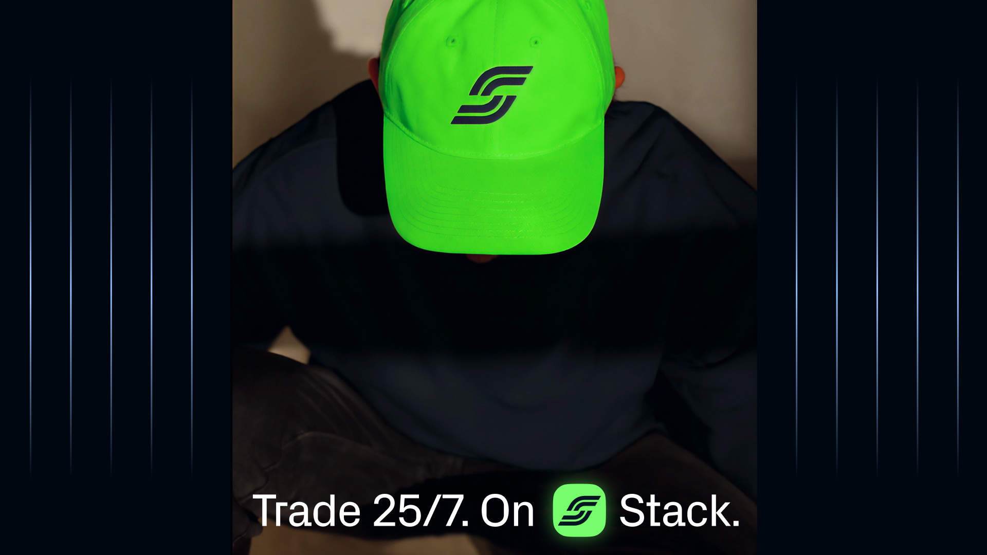
Stack
Brand Identity + Website Sprint
Stack is the first mobile app for leveraged markets, open 24/7. In a focused brand design sprint, I developed a visual identity that feels energetic, athletic, fast, and sleek, and Jan designed a build website that captures that feel. Early in the process, the founder also decided to change the company name entirely—right at the start of the sprint—which says a lot about the pace tech founders move at!
"Your ability to take ideas and turn them into something cohesive, beautiful, and functional has been such a pleasure to witness. I’m genuinely grateful for the time, energy, and care you’ve invested, and I’m excited to carry this momentum forward!"
Dariya Khojasteh
Founder, Stack app
Experiments
I played a lot gen‑AI this year, using it to create art direction, illustrations and imagery for real branding work. Keeping up with all the new creative tools takes time but it made me enjoy design more.
I tried to vibecode some programmatic brand asset generator tools, and looking to do more of that in next year.